Last Updated on February 9, 2025 by Monica Snyder
Do you want more clicks in your emails? If so, then you’re on the right page! Whether you're sending cold emails, a Linkedin connection request, or trying to push a deal forward, you'll find out what you need to do below.
You're going to want to read until the end: we are going to talk about four action steps you can take to get your calls to action super clickable, make your clickthrough rates go up, and see your conversions skyrocket from using this step by step guide!
Did you know that email marketing is one of the most effective vehicles for getting passive income into your life and into your business!?
Step 1: Using the TAP Formula for Your Email Call to Action
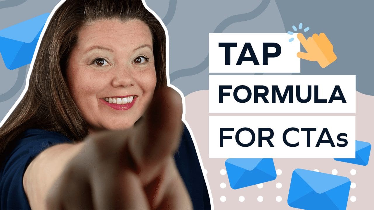
The first step to creating super clickable CTAs is to “TAP” into the right words!
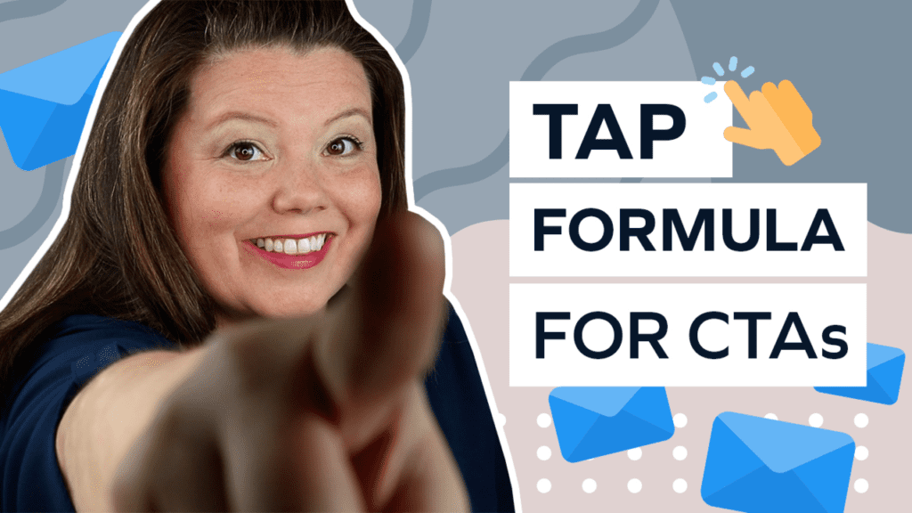
TAP is a formula I’ve created to help marketers like yourself learn how to put the right words together, even when you're crafting a cold email.
Once you know which words work best, your CTAs will have more of an impact on your reader. Different CTAs will work better or worse depending on your target audience.
For example, a cold email CTA would be vastly different than a newsletter to a warm audience!
Our email CTA examples can help you turn potential prospects into regular clients, regardless of if you're dealing with a warm lead or sending a cold email for outbound lead generation!
This means more clicks, more conversions, a more efficient sales outreach, and a higher chance that you'll see prospects respond!
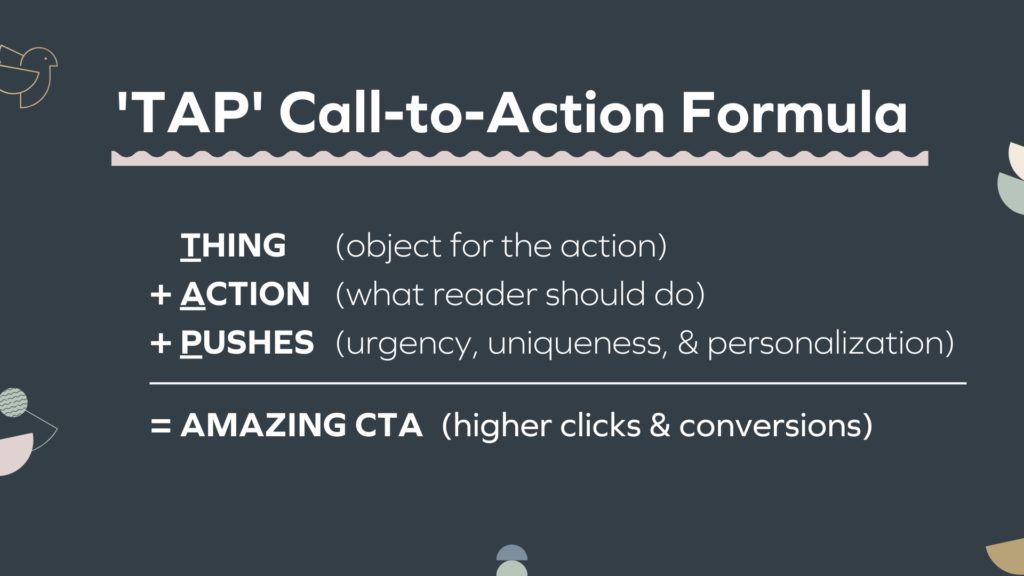
TAP - Create a Good Call to Action!
TAP stands for Thing, Action, and Pushes. Combining these three concepts together allows you to create amazing calls to action that result in more clicks.
So, let's break it down!
T: THING
The “T” (or the “Thing”) is the object of the action.
The T could be a blog post, a webinar, a calendar link, a download, or a quiz. Whatever you’re offering is the “Thing”!
Make sure to identify and internalize your T so you can make the perfect call for your email campaign.
Without knowing what the T is, we can’t move on to the next step in the TAP formula!
A: ACTION
“A” stands for “action”. This action is what the reader should do!
You want this to be a specific action verb, but unfortunately, not all action verbs are created equal! While some action verbs are better for email, others may be more suitable for landing pages.
Once we get through the formula, we’ll take a look at some of the different action verbs you can use.
P: PUSHES
The “P” is for “Pushes”. Pushes help your prospects feel intrigued, encourage new leads, and guide new visitors along the buying process.
These pushes are the gentle nudges you're going to write into your call to action, inspiring your reader to click. They add urgency, uniqueness, or personalization.
Incorporating pushes will make your email CTA feel more tangible so the reader will want to take the action you want them to take!
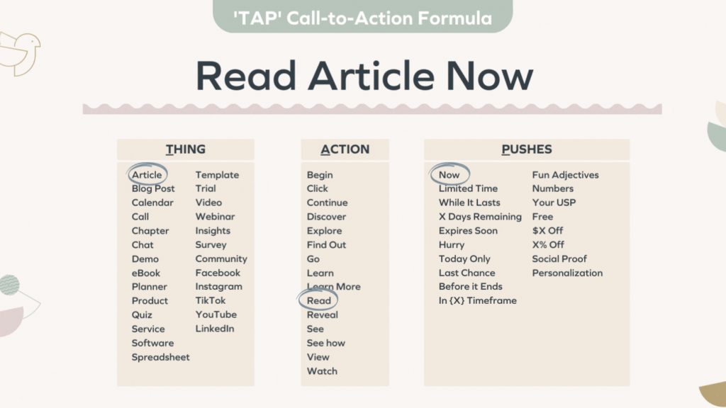
Urgency increases sales
You can create “urgency” in your push by adding words & phrases like “now” or “limited time”.
These tell the person that they don't have forever to do this, encouraging immediate action by creating a potential pain point! Pushes are perfect for most CTAs, but you’ll want to avoid making your call to action too lengthy.
Remember, you only need to add a couple of words to create urgency.
Uniqueness refines marketing
Another way to add a push to your email call to action is by highlighting your uniqueness!
For example, if you sell handmade soap, you could write the word “handmade” in your call to action. This lets people know that it's unique right off the bat!
Personalization interests prospects
Another great push to add to your CTA is personalization.
You can do this by using first-person pronouns. First-person pronouns like “I”, “we”, “us”, and “my” have shown to increase clickthrough rates by up to 90%!
Incredible, isn’t it?
Switching out the word “your” for “my” could drastically change your clickthrough rate! Adding those little pushes is really important to your call to action, so don't forget the P part of the TAP formula.
Picking the Perfect Verb Action Examples
Next, let’s determine which action verbs are the best call for email use, and which CTA types you’re going to want to avoid. That doesn’t mean those action verbs won’t work great in other spots of your funnel (such as a landing page or product pages).
It simply means that they aren’t the most effective tactic for use in your email campaigns!
Making Sense of Low Commitment Verbs
So which types of action verbs do work in emails and improve conversion rates? There’s actually a specific name for them: low commitment verbs!
“Low commitment verbs” are actions that the reader thinks are simple, such as the common action examples “read now” or “watch now”.
It’s been shown that using low commitment verbs in your emails makes a big difference, resulting in interested prospects & higher clickthrough rates!
Using High Vs. Low Commitment Verbs in Your Sales Email Call to Action
To your reader, the verb you choose represents the action(s) they’ll need to take after the click. “High commitment verbs” take many different steps to complete, which dissuades the user from clicking.
Here’s one common example: the simple phrase “Buy”!
“Buy” sounds simple enough, but it actually requires six or seven steps to complete the “buy” action. This means your readers must be interested and willing to make a commitment if they want anything to get done.
Compare that to “shop”, which not only sounds simple but also doesn’t require any specific commitments!
Your reader will be much more likely to click on a CTA that seems commitment-free, even if the actual process is the same.
The difference may be subtle, but it does make a difference in your calls to action!
CALL TO ACTION VERBS TO SKIP IN YOUR EMAIL MESSAGE
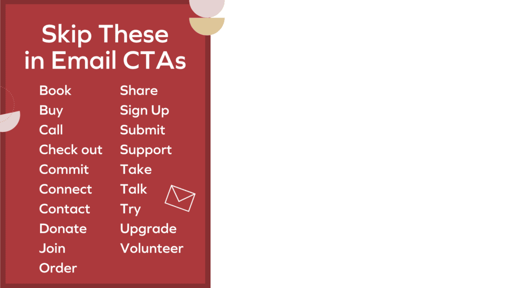
Above is a list of email call to action examples you should skip in emails. While they can be great for the rest of your funnel (such as on your website or for a blog post), they don’t tend to perform well for emails.
This is especially true if you're sending a cold email to a new prospect!
If you’re determined to use a call to action example listed above anyway, I recommend testing a few lower-commitment options against these high-commitment verbs.
What If I Prefer to Use a Specific Verb Listed Above?
Truthfully, your target market may love them, but statistically, that’s not the case!
If you want to write an actionable CTA then you're better off using one of the CTA examples shown below.
CALL TO ACTION VERBS TO CONSIDER
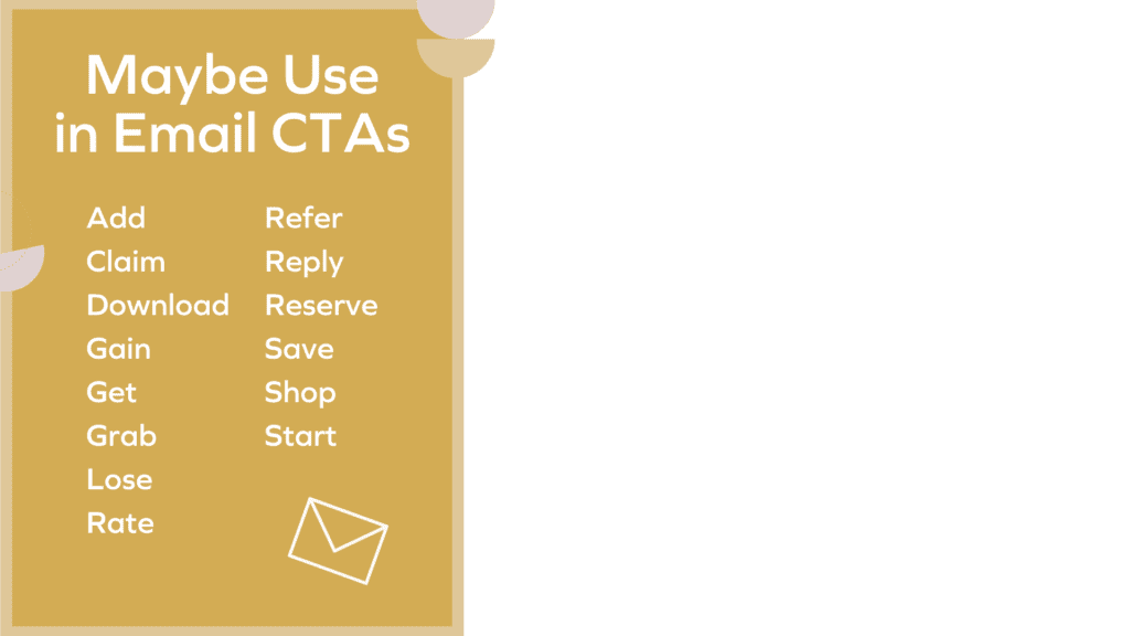
Unlike the previous list, these are email call to action examples that can be used sporadically. They’re what I call “medium-commitment”: they have one or two steps that need to be completed after the initial click.
A common example of a medium-commitment verb is “Download”.
“Download” requires the reader to first obtain something, and then consume it. Compare this to simply reading an article, which doesn't require a next action!
When Should I Use Medium-Commitment Verbs in my marketing?
Medium-commitment verbs can be used in your emails, but it’s best to test them against the “low-commitment” verbs we’ll be looking at next.
While medium-commitment verbs might perform decently in your emails, odds are, you could achieve better clickthrough rates with lower commitment verbs!
CALL TO ACTION VERBS FOR EVERY EMAIL (AND ON YOUR WEBSITE!)
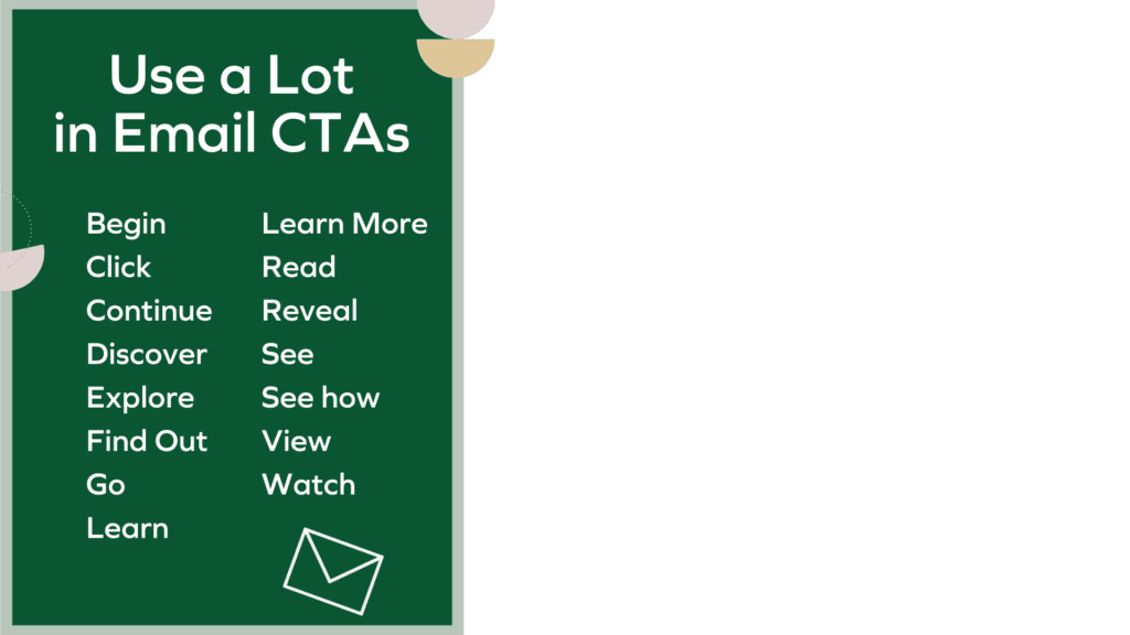
These “low-commitment” call to action examples are the verbs you’ll want to use all the time!
Perfect for email CTAs, they are extremely simple and the reader will understand what they’re getting into right from the get-go.
These verbs offer potential clients an opportunity, rather than requiring a commitment.
A/B Testing and Verb Choice
You’ll want to conduct a few A/B tests to see which email call to action example performs best on your target audience. However, if you use the TAP (Thing, Action, Pushes) formula, you’re sure to notice an increase in your click-through rates!
Step 2: Creating Clickable CTAs
Once you decide on the perfect verb for your CTA, you’ll need to use standout formatting.
In an email, the format of your CTA can be a text link, an image, or a button (like “Sign Up Now”!).
You may want to experiment a bit to see which method makes your readers reply the most!
Regardless of which method you use, it’s important to make your call to action stand out using contrast and white space!
Although the term “white space” may be unfamiliar, it’s pretty straightforward. It’s literally the blank space around your call to action!
Optimizing Text Links
You can call attention to your text link easily with a few different methods. One option is by placing your link in its own paragraph, with a few spaces above and a few spaces below (providing white space).
This method works for both text links and buttons!
Your text links can also be placed in the paragraph instead, utilizing contrast to differentiate themselves from the other text.
Creating Contrast
Contrast is used to make things stand out against the things around them.


TEXT
When it comes to text, contrast is created using color! For example, I use pink text links against black text in my emails to help my links stand out.
However, it’s important that your text remains readable while contrasting against the white background and nearby black text.
This is why all Google links are blue! Don’t just make your text black.


BUTTONS
Contrast is even more important when it comes to buttons! Fortunately, it’s easy to make your button instantly recognizable by using a dark background with light text (or a light background with dark text!).
ARROWS & ANIMATED GIFS
Another thing that you can do to add contrast to your text links (or your buttons) is to add arrows. This sounds simple, but adding arrows is a big deal!
It’s easy to add an arrow to your text, either by typing it using your keyboard or using an emoji/graphic.
One diamond company tested this and they found a 26% increase in clickthrough rate once they added an arrow to their CTA buttons!
The last way to create contrast is by using animated GIF buttons. An animated GIF button stands out, instantly creating contrast from the rest of the email.
Not only are they fun to use, but they can definitely increase your clickthrough rates using only one CTA.
The Perfect GIF Call to Action Template for Your Website!
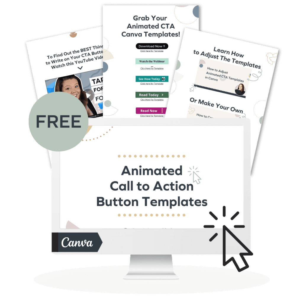
To help you with these, I’ve created a set of templates that you can get by clicking the image below.
These Canva-based templates allow you to change the text with ease. Since they are already animated for you, it only takes seconds to create your own animated GIFs with a live demo right in front of you!
Step 3: Choosing “Quality” Or “Quantity”
The third step you’ll want to take is comparing the “quality” approach to a “quantity”-based one. It’s certainly worth giving the “quality” approach a try.
In one study, the WordStream marketing company found that using only a single CTA button increased clickthrough rate by 371% (and revenue by 1617%)!
Quality
In my own experience, I’ve found the “quality” approach works best for sales, launch, and promotional emails. I get the best results when using only a single call to action in a sales email.
However, that doesn’t mean the “quality” approach is a fix-all solution.
Quantity
The “quantity” approach uses multiple calls to action.
It makes sense for non-sales emails like newsletters. Newsletter-style emails are designed to provide the reader with lots of information, rather than to push a particular product or encourage them down the buyer's journey.
For newsletters, using multiple CTAs is perfectly fine!
However, if you’re directly trying to sell a specific product then I recommend sticking to a single, high-quality call to action!
Step 4: Using Your Location to Your Advantage
The fourth and final thing you're going to consider for your email CTA is location. You could have only one location or many different locations spread throughout the page.
Don't confuse this with the actual content of the call to action though! The CTA is the same if it ends in the same place, but the call to action location could be in different spots on the page.
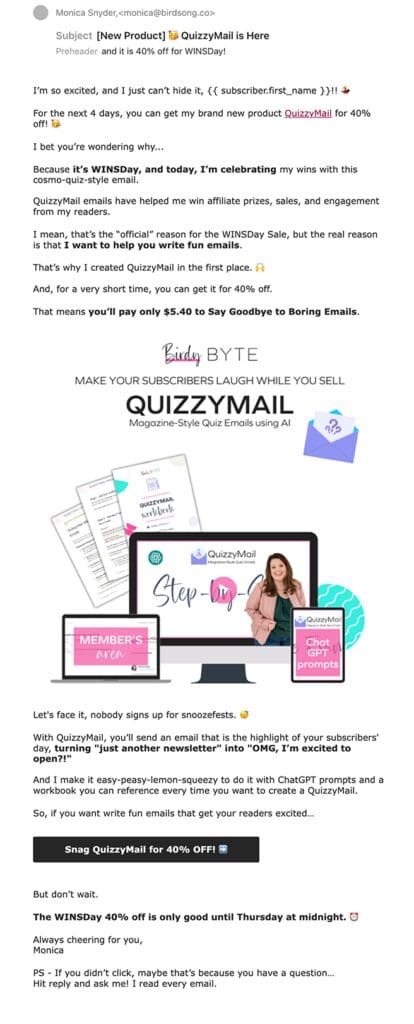
For example, you could have a text link up at the top and a button at the bottom, like in this example below. Also, in this example, the image in the middle is linked.
Making Your Emails Easier to Read
It turns out that most people read their emails in a “U” shape. This means that—after the subject lines—the top left corner is where people begin to read, continuing down to the bottom.
Next, they move back to the top and over to the right!
FINDING THE PERFECT PLACEMENT
If your CTA button is on the right, it may get missed (or be the last thing that’s looked at!).
Personally, I prefer to place my CTA down in the content after I’ve explained the topic at hand. This makes it stand out to people who are interested but may just be scrolling through the email.
Once they see the CTA, they think “Okay, this is the action I'm gonna take, but let me see what this action is about.” Then they'll come back and read it.
However, I don’t like to place the email CTA at the top of the page: it can feel a little jarring! At that point, I haven’t even introduced the point of the desired action I want them to take!
That’s why I always place mine on the bottom.
If you're doing a multi-part thing—like a newsletter with four sections—you should always place your CTA near the related topic.
For example, you'd want to place a calendar link near information about that particular event.
This is especially true if you have multiple calls to action! Improper placement can confuse your reader. It's even more important for cold emails.
However, there’s no need to overthink this. You can test to see what works best for your audience!
Remember, you are the leader for your reader. As such, you are the only person on the planet with your specific unique list.
It’s Time to Test These Methods for Yourself!
You're gonna have to test a few different email CTA approaches to find which one works best for you & your business. You can test any four of these things that we’ve covered above.
Regardless of which one(s) you try first, you’re sure to find better results!
Did I leave you with any unanswered questions? Have you already tried a few of the methods above? If so, how did it go?
Let me know in the comments below!
Pin & Read Later
